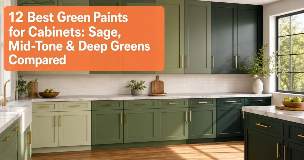
You’re scrolling through hundreds of green paint swatches, trying to figure out which one will actually look right on your cabinets. The problem isn’t finding a green you like online. It’s predicting how that green will shift in your specific lighting, next to your countertops, on your particular cabinet material.
There’s no universal winner because the best green cabinet paint depends on your lighting, hardware, and how much depth you want.
Key Takeaways
- Sherwin Williams Retreat, Sherwin Williams Pewter Green, and Benjamin Moore Dark Olive hold tone across lighting shifts better than competitors
- Sherwin Williams and Benjamin Moore offer the widest tested palette for green cabinets, while Farrow & Ball delivers premium depth at a higher price point
- Green shifts undertones more than neutrals when lighting changes, making in-room sampling non-negotiable
- Satin or semi-gloss finishes provide the durability cabinets need, while matte finishes stain and show wear within months
- Always paint sample boards and observe on actual cabinet doors for 48 hours before committing to full coverage
Best Green Paint For Cabinets Compared
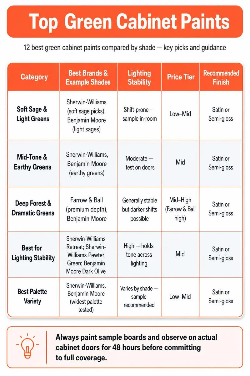
| Category | Best Brands & Example Shades | Lighting Stability | Price Tier | Recommended Finish |
|---|---|---|---|---|
| Soft Sage & Light Greens | Sherwin‑Williams (soft sage picks), Benjamin Moore (light sages) | Shift-prone — sample in-room | Low–Mid | Satin or Semi-gloss |
| Mid‑Tone & Earthy Greens | Sherwin‑Williams, Benjamin Moore (earthy greens) | Moderate — test on doors | Mid | Satin or Semi-gloss |
| Deep Forest & Dramatic Greens | Farrow & Ball (premium depth), Benjamin Moore | Generally stable; darker shifts possible | Mid–High (Farrow & Ball high) | Satin or Semi-gloss |
| Best for Lighting Stability | Sherwin‑Williams Retreat; Sherwin‑Williams Pewter Green; Benjamin Moore Dark Olive | High — holds tone across lighting | Mid | Satin or Semi-gloss |
| Best Palette Variety | Sherwin‑Williams, Benjamin Moore (widest palette tested) | Varies by shade — sample recommended | Low–Mid | Satin or Semi-gloss |
Quick Comparison Table
- Sherwin Williams Retreat 6208: Soft sage with warm undertones, holds tone in warm wood kitchens, satin or semi-gloss
- Sherwin Williams Evergreen Fog 9130: Greige-green, stays stable in low-light rooms, satin
- Benjamin Moore Avon Green HC-126: Soft botanical green, suits dining rooms and pantries, satin
- Benjamin Moore Peale Green HC-121: Mid-tone historic green, works with mixed metals, satin or semi-gloss
- Sherwin Williams Pewter Green: Gray-green, reads sophisticated on islands, semi-gloss
- Sherwin Williams Basil 6194: Natural herbal green, pairs with white oak cabinets, satin
- Benjamin Moore Antique Pewter 1560: Muted olive-green, complements stone countertops, satin or semi-gloss
- Benjamin Moore Dark Olive 2140-30: Rich moody green, needs ample layered lighting, semi-gloss
- Sherwin Williams Isle of Pines: Deep blue-green, creates jewel-tone impact, semi-gloss
- Farrow & Ball Green Smoke No. 43: Luxe dark green, shifts tone with light angle, any finish
- Benjamin Moore Caldwell Green HC-124: Deep sophisticated green, pairs with marble and brass, semi-gloss
- Sherwin Williams Cast Iron: Near-black green, provides maximum contrast, semi-gloss
Related Reading
A focused roundup of green cabinet formulas with application tips and how different shades perform on wood and laminate…
Soft Sage & Light Green Tones
These greens work when you want color without overwhelming a space, especially in kitchens where you’re keeping existing warm wood or need the cabinets to recede slightly.
Sherwin Williams Retreat 6208 reads as a muted sage with subtle warm undertones. Those warm undertones prevent it from going cold in kitchens with oak, maple, or warm-toned laminate flooring. It’s the safest choice if you’re uncertain about committing to green because it holds tone across lighting conditions without turning muddy or gray.
Pair it with brass cup pulls and white subway tile for a look that feels current but won’t date quickly.
Sherwin Williams Evergreen Fog 9130 leans more greige than pure green. This makes it ideal for north-facing rooms or spaces with limited natural light where a true green would look flat. The gray component keeps it from reading yellow in warm LED lighting, a common issue with lighter greens.
This color works on full kitchen cabinetry or as an island contrast to white uppers.
Benjamin Moore Avon Green HC-126 brings a botanical softness that works better in dining rooms, butler’s pantries, or smaller cabinet projects than in full kitchens. It has more color saturation than Retreat, so it makes a statement without going dark. This shade pairs particularly well with unlacquered brass hardware that will patina over time.
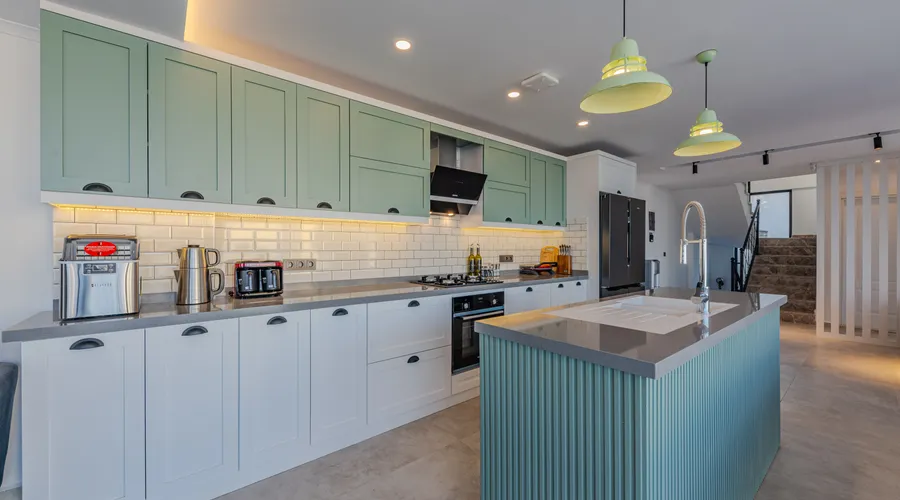
Mid-Tone & Earthy Greens
Mid-tone greens offer the most versatility because they have enough depth to hide minor imperfections but don’t require perfect lighting to look intentional.
Benjamin Moore Peale Green HC-121 is a historic color that balances cool and warm undertones. This balance works with modern and traditional hardware. It reads as a true green rather than leaning sage or olive, which gives cabinets presence without drama.
This color handles mixed lighting well and doesn’t shift between morning and evening.
Sherwin Williams Pewter Green combines gray and green in equal measure, creating a sophisticated neutral. It works on islands and vanities paired with white perimeter cabinets. The gray component prevents it from reading garden-like in modern spaces with stainless appliances and concrete-look tile.
Sherwin Williams Basil 6194 brings a natural herbal green that complements the current trend toward white oak and light wood tones. It has enough warmth to avoid looking institutional but stays grounded enough for everyday kitchens. This shade works particularly well in homes with open floor plans where the kitchen flows into living spaces with warm wood furniture.
Benjamin Moore Antique Pewter 1560 leans olive-green with muted saturation. This makes it an excellent partner for stone countertops like soapstone or honed granite. It has an aged quality that suits remodels aiming for an unfitted or furniture-like cabinet look rather than a built-in modern aesthetic.
Deep Forest & Dramatic Greens
Deep greens require commitment and good lighting, but they deliver drama and sophistication that lighter greens can’t match.
Benjamin Moore Dark Olive 2140-30 provides rich color saturation without going completely dark, making it more versatile than near-black greens. It needs either strong natural light or a well-planned artificial lighting scheme to avoid looking muddy. Pair it with white or very light countertops to maintain contrast.
Sherwin Williams Isle of Pines pulls blue-green in most lighting, giving it a jewel-tone quality. It works for statement lower cabinets, kitchen islands, or powder room vanities. The blue undertone makes it cooler than olive-based deep greens, so it pairs better with nickel or chrome hardware than with brass.
Farrow & Ball Green Smoke No. 43 delivers a complex, layered green with exceptional depth. This depth justifies its premium price in high-end remodels. The color shifts between gray-green and true deep green depending on light angle, creating visual interest throughout the day.
This paint’s formulation also provides superior coverage and a luxurious finish quality.
Benjamin Moore Caldwell Green HC-124 offers deep sophistication that pairs beautifully with white marble countertops and brass hardware. It has enough warmth to avoid looking black in low light but enough depth to create drama. This color works best when you’re painting only lower cabinets or an island rather than full wall-to-wall coverage.
Sherwin Williams Cast Iron sits at the edge of being a near-black green. It reads almost charcoal in low light and reveals green only in direct light. Use this for maximum contrast against white walls and light countertops, or when you want cabinets to visually recede.
This approach lets other elements like a colorful backsplash or statement range take focus.
Related Reading
A comparison of paint-and-primer products that helps decide if a combined formula will save time and improve coverage…
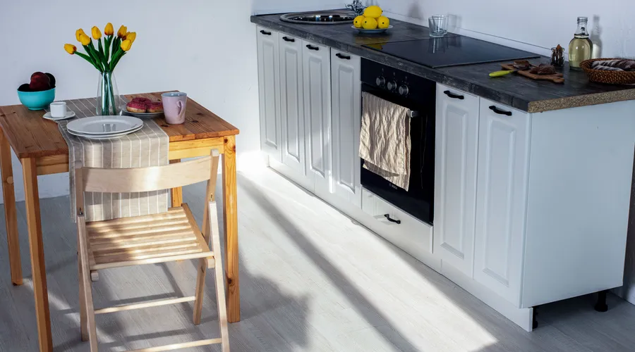
How Lighting Affects Green Cabinet Paint
Green reacts to light more unpredictably than neutrals because it sits between warm yellow and cool blue on the spectrum.
North-facing light pulls gray and blue undertones forward, making warm sage greens look muddier and blue-greens look grayer. If your kitchen faces north, test your samples in late afternoon when the light is at its coolest. Colors that survive harsh light will work year-round.
South-facing light warms every green, sometimes to the point where a sage green you liked in the store starts reading yellow-green on your cabinets. Sample boards should be observed at multiple times of day, particularly mid-morning and late afternoon. What looks perfect at noon might look completely different at 4 p.m.
LED color temperature changes green appearance more than you’d expect:
- Warm LEDs (2700K-3000K) push greens toward yellow
- Cool LEDs (4000K+) make greens look gray-blue
- If you’re replacing lighting, choose LED temperature first to avoid paint mismatches
Best Paint Finish for Green Cabinets
Cabinets take more abuse than walls, so finish choice directly affects how long your paint job looks fresh.
Satin finish offers the best balance for most cabinet projects. It provides enough sheen to be wiped clean easily without showing every minor surface imperfection. Most cabinet-specific paints from Benjamin Moore Advance and Sherwin Williams Emerald Urethane perform best in satin, where their self-leveling properties create a furniture-like appearance.
Semi-gloss increases durability and makes cleaning easier, particularly on cabinets near the sink or stove where grease and water splatter. The tradeoff is that semi-gloss highlights every surface flaw, making it a poor choice for older cabinets with dings or visible wood grain. On new or perfectly prepped cabinets, semi-gloss gives a crisp, professional look.
Matte or flat finishes look beautiful initially but fail quickly on cabinets:
- They absorb stains and show wear around handles
- They can’t be scrubbed clean without damaging the finish
- Save matte for walls, not surfaces you touch regularly
Coordinating Materials & Hardware
Hardware and surrounding materials can make the same green read completely different.
Brass and aged bronze work with nearly every green because they share warm undertones. Unlacquered brass that develops a natural patina pairs particularly well with sage and mid-tone greens. Polished brass creates more contrast with deep greens like Dark Olive or Isle of Pines.
Brushed or antique brass provides a middle ground that suits both traditional and transitional styles.
Nickel and chrome suit cooler greens, particularly those with gray or blue undertones like Pewter Green, Evergreen Fog, or Isle of Pines. Mixing warm green cabinets with cool silver hardware creates visual tension that can work in modern spaces but often looks off in traditional kitchens.
Countertop material changes how your green reads:
- White countertops create sharp contrast with any green, making the color read more saturated
- Quartz, marble, or solid-surface whites work particularly well with deep greens
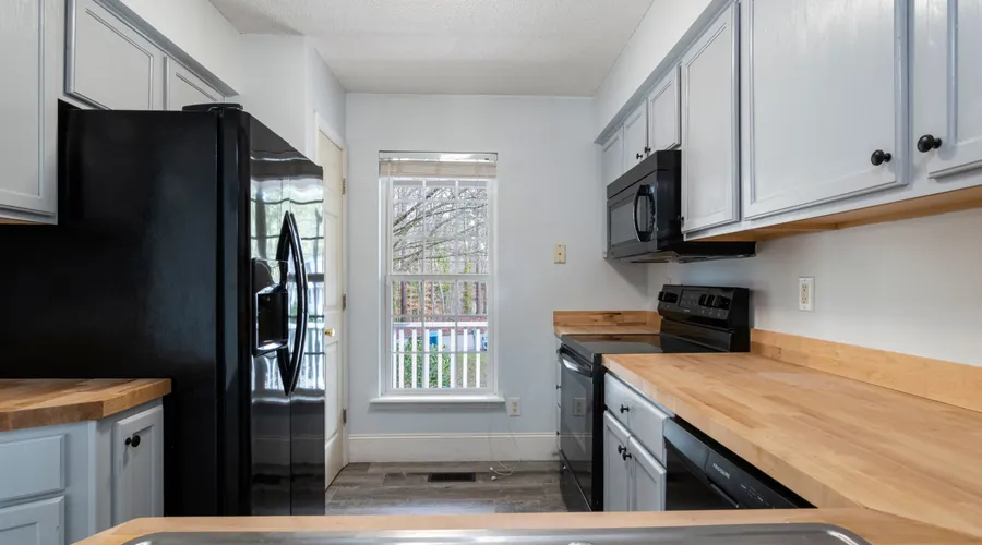
- Butcher block warms sage tones and creates a natural, organic feel
- Wood countertops with strong orange tones can make mid-greens look muddy
Backsplash tile should echo your green’s undertone without trying to match the exact color. If your green leans warm, choose cream or warm white subway tile. If it leans cool or gray, opt for cool white or light gray tile.
Avoid green tile matching cabinets, as slight mismatches look like mistakes rather than intentional contrast.
Related Reading
Water based vs oil based primer
A clear breakdown of water- vs. oil-based primers to help you choose the right primer for adhesion, sanding, and…
How to Choose the Right Green for Your Cabinets
Narrowing dozens of options to the one right green requires a systematic approach.
Start with your room’s lighting and fixed surfaces you aren’t changing:
- If you have north-facing windows, cross off blue-undertone greens
- If you have warm oak floors staying, eliminate cool gray-greens
- If you have white marble countertops, you have maximum flexibility since white works with any green
Narrow to one tone category based on how much drama you want and how much light your space receives:
- Soft sages work in any lighting and suit cautious color choices
- Mid-tone greens provide the most versatility in average lighting
- Deep greens require abundant natural light or layered artificial lighting
Buy sample pints of 2-3 finalists within your chosen category. Paint them on poster board or directly on cabinet doors, not on the wall. Vertical surfaces reflect light differently than horizontal ones, and you need to see the color where it will actually live.
Observe samples for 48 hours minimum, checking them in morning light, afternoon light, and under your evening artificial lighting before deciding.
FAQs
1. What is the best green paint color for kitchen cabinets?
Sherwin Williams Retreat works for the widest range of kitchens because its warm sage tone stays stable across lighting conditions and pairs with both modern and traditional styles. If you want more depth, Benjamin Moore Peale Green provides versatile mid-tone color that works with mixed metals and various countertop materials.
2. Which green is best for kitchen cabinets, Sherwin Williams or Benjamin Moore?
Both brands offer excellent cabinet-specific formulations, so choose based on the specific color rather than the brand. Sherwin Williams Emerald Urethane and Benjamin Moore Advance both provide durable, self-leveling finishes. Test your preferred colors from each brand to see which tone works better in your lighting.
3. What is the best dark green for kitchen cabinets?
Benjamin Moore Dark Olive provides the most versatility in the deep green category because it has enough warmth to avoid looking black but sufficient depth for drama. It needs good lighting but works in more situations than cooler dark greens like Isle of Pines.
4. Is sage green a good choice for cabinet paint?
Sage green works well for risk-averse projects because it provides color without overwhelming a space and pairs easily with most materials. The main risk is that sage can look dated if it skews too yellow, so choose versions with slight gray undertones like Retreat or Evergreen Fog.
5. What finish should green cabinet paint be?
Satin finish handles best for most projects because it cleans easily without highlighting surface imperfections. Use semi-gloss only if your cabinets are new or perfectly prepped. Avoid matte finishes entirely on cabinets.
6. What hardware goes best with green cabinets?
Brass in any finish works with nearly all greens because of shared warm undertones, while nickel and chrome pair better with cool gray-greens. Choose unlacquered brass for a lived-in look that develops patina, or polished brass for maximum contrast with deep greens.
7. How do I choose the right green for my cabinet project?
Start by identifying your room’s lighting direction and fixed surfaces you can’t change. Then narrow to one tone category based on how much drama you want. Buy sample pints of 2-3 colors, paint them on poster board, and observe them on your actual cabinets for 48 hours before committing.
8. Does Joanna Gaines use a specific green for cabinets?
Joanna Gaines has featured various greens on cabinets across different projects, often gravitating toward muted sages and mid-tone historic greens like those in the Benjamin Moore Historical Collection. She typically pairs them with brass hardware and marble or butcher block countertops. She adapts to each home’s lighting rather than using a signature shade.
Final Verdict
If you’re uncertain about committing to green, start with Sherwin Williams Retreat because it stays stable across lighting and pairs with the widest range of materials. For maximum versatility in the mid-tone category, Sherwin Williams Pewter Green works on islands and full kitchens and suits both modern and traditional hardware. If you want bold drama and have the lighting to support it, Benjamin Moore Dark Olive delivers sophisticated depth without going completely dark.
Green shifts more dramatically than neutrals when lighting changes, making sample testing non-negotiable. What looks perfect on a swatch or on someone else’s Instagram can look completely wrong in your specific space with your specific light.
Order 2-3 sample pints in your chosen tone category, paint them on poster board, and observe on actual cabinet doors for at least 48 hours before buying full gallons.
If you’re in the Denver metro area and want green cabinets without the DIY risk, our team handles prep, spray finishing, and color consultation. We can match any of these greens to your kitchen’s lighting and layout and help you avoid costly color mistakes. See our interior painting services, or call 720-831-8998 for a free estimate.